Tuesday, December 14, 2010

no Art Sale without the SB!

Every November is the MCAD Art Sale and we print a TON of signage for the event.

All of this year's signage was printed on our new Epson 9900.

This was the longest single print we've ever done - 23 FEET!

Monday, November 22, 2010

Digital Coloring Tutorial

Anthony "Nedroid" Clark gives a great overview of his digital coloring techniques.


Here's another post of Anthony's on coloring that also gets into lighting/effects techniques.
In addition to his own amazing Nedroid Picture Diary comics, Anthony is also the colorist for the popular Dr. McNinja webcomic. Check out his work!

Sonja Rostad's "Personal History vs. World History"

Sonja created a booklet for each year of her life, comparing her personal history to the events of world history.

Personal History vs. World History 24 booklets- 4"x11" folded

"This project involves a booklet for every year of my life. I wanted to look at the events that were happening during the year and juxtapose it to events that were happening in my life. As you unfold the booklet completely, there is a Nasdaq chart for the year with the different events plotted in a timeline on the graph, using symbols that I assigned from the previous page. This was meant to show how world events affect the economy, and how these things also impact personal life. All of the symbols used for each year is on the cover. They are then put on the back cover in a circle. Each year's circle gets added to the next years booklet.


The photos used are all from documented non-personal photos like drivers licenses, school ids, and baby pictures. I wanted to make it less personal by using these photos that society expects from us. It also enforces my idea of using these booklets, which are normally something handed out to many people, to showcase my life."

Also check out this group project Sonja contributed to, the 2012 Book.


Dylan Lathrop and Colin Trechter's "What Do the Twins Mean to Minnesota?"

Dylan and Colin made great use of our versatile perfect binding machine in the making of this book - utilizing such elements as different sized page inserts/tabs.


In their words:
"This book was a collaboration between myself and my classmate Colin Trechter. We attended an event (in this case, a Minnesota Twins game) and gathered imagery and content from that time. We then sent out a brief survey to the fans of the Minnesota Twins and were floored by the honesty and beauty of what they had to say. The book uses those quotes and inserted information about the team—from the players to the stadiums to the Dome Dogs. The book resides for both novice and the die hard, with local charm which we both love about this city."


Both gentlemen do great work - do yourself a favor and check out the rest of their work HERE and HERE.

Thursday, October 28, 2010

New Epson 9900 Banner Printer

It's been five years (!) since we got our Epson 9800 and despite professional service, it was time to replace it. With the wide variety of media we run through it, it was just getting too difficult to get the best prints from the 9800. So we got a new Epson 9900!


It arrived on Wednesday in its giant box and we proceeded to drool as we unpacked the beast. One staffer who helped with some of the heavy lifting said it looked like a piano in a box!


First print!

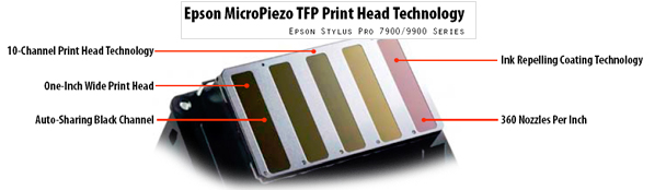
Aside from simply being new, the 9900 has many advantages over the 9800. It's rated at being at least twice as fast, does automatic nozzle checks and cleanings, has an ink repellent coating on the print head for fewer clogged nozzles, the ability to switch between Photo and Matte Black inks, and the addition of Green and Orange inks for a wider color gamut.

The auto black switching will be great. On the 9800 we could only run Photo Black ink which meant that if you printed on Matte papers your blacks looked very flat and dusty. Not so anymore! Anyone who's printed on the 4880 running Matte Black knows the difference and it's quite spectacular.

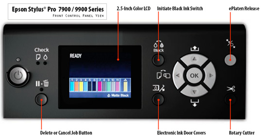
There's a new color LCD control panel that allows you to pilot the printer in style - specific paper settings, manual ink switching, and unlocking of the electronic ink hatches! Totally sci-fi!

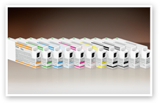
The addition of the Orange and Green colors as well as the dual black support means a total of ELEVEN inks. The 700ml ink carts feel like bricks!
 

The color gamut of the 9900 inkset (the range of colors it is able to produce) is larger than the standard on screen Adobe RGB 1998 profile so your prints will look more spectacular than ever!
(the grey area are the colors the 9900 is able to reproduce outside the standard Adobe RGB gamut.)

And finally, the fancy new print head with all of its bells and whistles.


Our old 9800 doesn't get to completely retire yet though. We're going to hang onto it for fabric printing and other experimental media use (so we don't mess up the new one!).
(here we are throwing a semi-retirement party for the 9800)

PRINT AWAY!


Tuesday Bassen's "Studio Sweet Studio" zine

Tuesday put together this nifty little zine about artists and their studios. Printed on the SB's Konica Bizhub c650 on Hammermill Fore MP Colors Grey paper.

Tuesday, October 12, 2010

A Day in the Life of the MCAD SB

A day at the SB - 8am to Midnight.

Wednesday, April 28, 2010

SB Cards Expiring // Lower Prices Coming!

The Service Bureau will be introducing a new pricing structure for Fall'10. We are working hard to offer our services and supplies at the best prices we can - all ON CAMPUS!

We are still working out the details but please be advised that ALL CURRENT SB CARDS WILL EXPIRE OVER THE SUMMER. Beginning Fall'10 there will be new SB Cards issued and all old ones will be invalid. In other words, you won't be able to use the old cards to pay for SB services come fall semester.

So - be mindful with your SB Card purchases until the end of this semester and if you're leaving campus for the summer or graduating, use those credits up, or sell them to someone who can use them!

When we have specifics on the date of the actual implementation and expiration of old cards, we will let you know well in advance.

As always, thank you for your patronage and support!


Monday, April 19, 2010

Sarah Kissell's "Still Remains - The Immortal Cycle of an Icon: Jacqueline Kennedy Onassis"

Check out part of recent alum Sarah Kissell's senior project: a tribute to Jackie O and 60's fashion wrapped up in an elegant book package that celebrates the style of the 1960's.


Sarah's dedication, attention to detail and perfection in her craft resulted in a gorgeous book. Sarah now works as a designer at Urban Outfitters.

Tuesday, March 23, 2010

Jacey Braband's Google Book and Mai Hoa Salon Identity

Award for the thickest book we've ever bound goes to Jacey Braband's "Meaning of Life/Google Book." It is nearly 2 inches thick and makes extensive use of half-gatefold dividers, several paper stocks and a metallic silver cover. Check out this impressive tome!


Jacey also gets points for innovation with her Mai Hoa Salon identity system. She utilized the Konica c650 to double print different parts of her design to create the appearance of a gloss spot-varnish. This is a good example of experimentation with process and materials and of exploiting what seems like a limiting technology (laser printing) to achieve sophisticated looking results.

Tuesday, February 16, 2010

What the Heck is a Giclée Print?!

You may have heard people talk about "Gicée Prints" or occasionally have a client ask for one. I'll confess, the first time I heard this term I assumed it meant some type of special printing process since it sounded fancy.
Giclée (pronounced /ʒiːˈkleɪ/ "zhee-clay" or /dʒiːˈkleɪ, from French [ʒiˈkle]) is a neologism for the process of making fine art printsfrom a digital source using ink-jet printing. It is basically a fancy term for a very nice, archival quality inkjet print. The Epson printers in the MCAD Service Bureau and Digital Photo Lab are the same models that many fine art printers use to produce their prints.


The word "giclée" is derived from the French language word "le gicleur" meaning "nozzle", or more specifically "gicler" meaning "to squirt, spurt, or spray"[1]. It was coined in 1991 by Jack Duganne,[2] a printmaker working in the field, to represent any inkjet-based digital print used as fine art. The intent of that name was to distinguish commonly known industrial "Iris proofs" from the type of fine art prints artists were producing on those same types of printers. The name was originally applied to fine art prints created on Iris printers in a process invented in the early 1990s but has since come to mean any high quality ink-jet print and is often used in galleries and print shops to denote such prints.
These swanky dudes are making Giclées in their basement - if they can do it, you can do it!


(Info referenced from http://en.wikipedia.org/wiki/Giclée)

Thursday, February 11, 2010

Justin McKinley's Printscreen Magazine

In the Fall of 2008 our very own Justin McKinley did a project for his Web and Screen class where he set up his computer to take a screenshot every 15 minutes. He used the images and data to build a website but also to design a book for his Publications class. The result was impressive - simple yet effective and addictive for its voyeuristic aspect. (It is also one of the heftier books we've bound.)


Wednesday, January 27, 2010

Aimee Gauthier's 'Sifted' and 'Let's Play'

A couple of neat projects by recent grad (and current MCAD DesignWorks Intern) Aimee Gauthier. The first is a cookbook project titled, "Sifted."


And then there is her Senior Project - a play kit called, "Let's Play."


For more of Aimee's work, go here:
http://www.aimeegauthier.com/
http://notionspotions.blogspot.com/

Thursday, January 21, 2010

INK!

We go through a lot of ink here at MCAD. We have 8 Epson 4800s and 1 Epson 9800 used by hundreds of students each semester. Last year we burned through over 280 of the 220ml ink cartridges. After looking at our ink usage over the last year or two we decided that instead of ordering ink every few weeks or months as we needed it, we would just order an entire year's worth. This is what an entire year's worth (we hope) of ink looks like:


Monday, January 18, 2010

Journey to the Stars

Check out our new display print! It's HUGE!!!

The display print is a small section of a much larger image of our galaxy.


The full image was stitched together from over 800,000 frames from NASA's Spitzer Space Telescope and is over 2.5 billion pixels wide!  This display print is just one of 16 sections.  Each section is approximately 25,000 pixels wide and at this print size is 165" (13.75 feet) wide.  If you were to print the entire image at this same proportion it would be 220 feet long!

This is a three-color composite that shows infrared observations from two Spitzer instruments. Blue represents 3.6-micron light and green shows light of 8 microns, both captured by Spitzer's infrared array camera. Red is 24-micron light detected by Spitzer's multiband imaging photometer. Different objects emit at different wavelengths: thermal emission, or heat, from warm dust is rendered in red, while star-forming regions appear as swirls of red and yellow, where the warm dust overlaps with the glowing organic molecules. The diffuse green glow seen everywhere in the image is from complex organic molecules called PAHs, or polycyclic aromatic hydrocarbons. On Earth those are created when fossil fuels are burned; in space, they are byproducts of stellar birth and death.  The blue specks sprinkled throughout the photograph are Milky Way stars.

The Galactic Legacy Infrared Mid-Plane Survey Extraordinaire team (GLIMPSE) used the telescope's infrared array camera to see light from newborn stars, old stars and polycyclic aromatic hydrocarbons. A second group, the Multiband Imaging Photometer for Spitzer Galactic Plane Survey team (MIPSGAL), imaged dust in the inner galaxy with Spitzer's multiband imaging photometer.

Our display print is 25,000px / 165”(13.75') wide, took 5 hours to print on the Epson 9800 on Premium Luster Photo Paper (260) and would cost you $165!


Image Credit:

The Infrared Milky Way: GLIMPSE/MIPSGAL
Spitzer Space Telescope/IRAC/MIPS
NASA/JPL-Caltech/E. Churchwell (University of Wisconsin), GLIMPSE Team and S. Carey (SSC-Caltech), MIPSGAL Team

Friday, January 15, 2010

Pam Salen's "I Remember Dreaming"

The inaugural MCAD SB Blog post goes to Pam Salen in honor of her impending departure for grad school in Australia.  Pam has served as the Senior Admin Assistant and Publication Designer in the Student Affairs office for 7 or 8 years.  Recently she finished up her BFA degree through MCAD and this was her senior project.


I Remember Dreaming, 2009
Paper, Digital and Ink-Jet Prints
Banners: 22 x 72 in. (55.9 x 182.9 cm)
Book: 5 1/2 x 11 in. (14 x 27.9 cm)


The large hanging prints were run on our Epson 9800 on Inkpress 7mil Transparency Film. The books were printed on our Konica BizhHub c650 on clear transparency film and Mohawk Color Copy 98 paper.


See more about this project and the rest of her work at her website.